CDC Design Blogs
1 - 6 CDC blogs
2 - Personal Interests
Entry 1 : What is product design?
For our first CDC lecture, we looked at the question: what actually is product design? It’s something everyone in the course gets asked, especially in Ireland where it’s not the most obvious or well-known career path. Before this, I would’ve probably given a very basic answer, but the lecture made me realise how broad and subjective it actually is.
We explored the idea of subjective vs universal design, which I found really interesting. Some products are designed to suit a wide range of users and situations, while others are more specific or niche. It made me think about how not all “good design” works for everyone, and that context plays a huge role in how a product is perceived and used. We also looked at Dieter Rams’ 10 principles of good design, and whether they still apply today. While a lot of them seem quite universal, like being functional, simple, and long-lasting. I started to question whether they can really apply to every type of product. For example, some modern products focus more on emotional appeal or branding rather than pure function, and they can still be considered successful.
So I think while the principles are a strong foundation, they aren’t always strict rules. Looking at different examples in class also helped me understand how varied product design can be. Some designs focused heavily on aesthetics and creating a soft, approachable feel through colour and form, while others were more technical and function-driven. It made me realise that product design isn’t just about how something looks, but how it works, how it feels to use, and how it fits into someone’s everyday life. One thing that stood out to me was how much user experience is involved. A well-designed product should be intuitive and easy to use, without the user having to think too much about it. This links back to the idea of universal design, where products aim to be accessible and usable by as many people as possible. Going forward, I think I’ll be more aware of the decisions behind everyday products and what makes a design objectively 'good' and what rules did the designer apply.
After I watched an episode of Abstract; the art of design on YouTube, I watched the one on Tinker Hatfield and the Design process behind Nike and footwear and I just really like that approach to design where they have so many parties involved from different areas - athletes - coaches - designers - artists, For them its not just a design it was Constantly innovating to be better their work flow alongside the constant involvement of users and maintain this super strong consistent brand identity was so interesting to see.
During the podcast listening my favourite one was the discussion of Cas Holmen, I had never heard of her before or just "play" designers in general, Lucie mentioned her having her own episode on abstract as well which I am looking forward to watching because again her approach and mindset is just so different you don't see it in everyday design.
Overall, this changed how I define product design - not just as creating objects, but as designing experiences that balance function, usability, and emotional connection. Seeing designers can involve multiple disciplines and constant user feedback reinforced that good design is never static, but continuously evolving.


Entry 2 : Opening our eyes
I really enjoyed this lecture on how to “open your eyes.” I think throughout first year of PDT and the beginning of second year, most of our modules have been focused on building skills and learning design fundamentals, which are obviously very important. However, we hadn’t really looked at actively seeking out or recognising inspiration in the everyday environment around us. A lot of the references we usually use come from online sources, often highly polished CAD renders or finished products that have gone through a full manufacturing process.
These are then placed into curated mood boards that can sometimes feel quite controlled, with very little variation. This lecture encouraged a different approach, focusing more on observing what already exists around us rather than only relying on idealised outcomes. One activity involved cutting a small square out of a piece of paper and using it as a frame to explore the university. This simple exercise made me realise how much detail is often overlooked. By isolating small sections of the environment, patterns, textures, and imperfections became much more noticeable. It highlighted the contrast between natural and purposeful forms, and how both can be used as sources of inspiration. We also watched a clip from Ferris Bueller’s Day Off, which reflected a similar idea. The way Ferris uses his surroundings creatively showed how design thinking can come from working with what is available, rather than relying on perfect conditions. It emphasised the importance of observation and adaptability to achieve his goals.
Overall, this lecture made me more aware of how inspiration doesn’t always need to come from finished or highly refined designs. Instead, it can be found in everyday details, imperfections, and environments. It encouraged me to look more closely at what is around me and to use these observations as a starting point for design ideas.
We all applied this logic further on our class trip to London, even though our planned activities were very enjoyable some of the key highlights from the trip were some of the smaller quieter moments - just looking at buildings, streets, bodies of water and just regular everyday things that people are interacting with on the daily. Even learning the routes for the underground and living like a local was really nice it was just like a complete cut-off from the responsibilities of being at home, and seeing that life is happening everywhere all the time and there is an unlimited amount of inspiration out there. I think in college you get in the same rhythm of doing assignments just to meet a marking scheme or looking at the same examples of what a good design is but when you have no benchmark your ideas can go beyond that ceiling.


Entry 3 : Wes Anderson Exhibition
On our course trip to London, we visited the Design Museum where we went to see the Wes Anderson exhibition. I had always liked his films, but seeing the exhibition made me realise how much thought and detail actually goes into every single aspect of them. What stood out the most was Anderson’s attention to detail, especially in terms of colour, symmetry, and composition.
Everything was so carefully considered, from the colour palettes to the placement of objects within a scene. It made me realise how intentional design can completely shape the mood and identity of something. I was also really interested in the process behind the films, particularly the amount of sketching and prototyping involved. I hadn’t really thought about how much physical making goes into stop-motion before. Seeing the models up close, and understanding how they are constructed to move in specific ways, was really fascinating.
The internal mechanisms that allow the characters to move realistically on screen showed a strong connection between design and engineering. One of the most interesting parts for me was how the facial expressions were modular, they could be swapped in and out depending on the scene. This made me think a lot about product design, especially in terms of modularity and adaptability. It shows how designing with flexibility in mind can make something more functional and efficient, even in something as creative as film. Even the layout of the exhibition itself reflected Anderson’s style. It was very symmetrical, well-structured, and easy to follow. The way everything was displayed felt intentional and flowed naturally from one section to the next, which made the experience more engaging. It didn’t feel random or cluttered, everything had its place. While Anderson’s level of control creates a strong and recognisable style, it also made me question whether too much precision could limit experimentation. This balance between control and flexibility is something even early sketches look like finalised concepts I was love to see how he gets to this point in his process or if he prefers to thinks in full concepts and mentally define them.
Overall, the exhibition helped me understand that design goes far beyond just the final outcome. It involves a huge amount of planning, iteration, and attention to detail. It also showed how important it is to have a clear visual language and to stay consistent with it. After visiting, I feel like I’ll be more aware of composition, colour, and structure in my own work, and how these elements can be used together to create a strong and unique design style.


Entry 4 : Vikas Sethi - CMF designer
As part of our Design Culture module, CMF (Colour, Material and Finish) designer Vikas Sethi visited to talk about his role at Aston Martin and explain his workflow. At first, I didn’t expect to be that interested, mainly because I don’t have a strong background or interest in cars. However, my opinion shifted once he started explaining his "why" behind his process.
What stood out most was how much emphasis he placed on research, user identity, and cultural context, rather than just aesthetics. I had always associated car design more with engineering or just super technical work , but his presentation showed a completely different side focused on storytelling and meaning. His process involved a lot of visual exploration, mood development, and concept building, which made it feel much more aligned with creative design than I had thought . One project that I found particularly interesting was his work for Dacia, where he took inspiration from the four elements: fire, air, water, and earth. He translated these into different colours, materials, and textures to represent the energy and characteristics of each element. This made me realise how CMF can be used to communicate ideas and emotions, not just to make something look good. I also found it interesting that Sethi mentioned he isn’t necessarily driven by a passion for cars themselves, but more by the conceptual and creative aspects of the work. I found that really interesting , as it made CMF feel more aligned with what design I like and maybe a path id like to look into that bit more it didn't feel as gated of a practice. He showed that you don’t have to be focused on the product type itself, but rather on how you can shape the experience and perception of it through design decisions.
The talk linked really well with our own CMF exploration project in the Design Visualisation module. Seeing his work helped me better understand the importance of finish and material choices, and how they can influence both usability and perception. It made me more aware of how decisions like matte vs gloss, texture, and colour contrast can completely change how a product is experienced. Overall, the talk gave me a much clearer understanding of CMF as a discipline. It’s not just about surface-level decisions, but about creating a cohesive identity through colour, material, and finish. It also encouraged me to explore CMF further in my own work, and to think more carefully about how these elements can be used intentionally rather than just aesthetically.


Entry 5 : Caoimhe Kelly - Footwear Designer
As part of our Design Culture module, footwear designer Caoimhe Kelly led a workshop focused on footwear analysis and concept development. This peaked my interest as I am a fan of fashion and apparel design and it was nice to see an Irish designer make a career out of it I feel like its a sector you always hear there isn't enough demand to justify it as a career.
During the session, we were assigned different brands to research and respond to through ideation. My group was given Birkenstocks, which encouraged us to think about the brand’s identity and how it could be reinterpreted in a more contemporary way. What I found most engaging about the workshop was the balance between research and creative exploration. Instead of jumping straight into designing, we first had to understand the brand in detail. Looking at Birkenstock’s core values-comfort, functionality, and recognisable form-helped guide our design decisions while still leaving space to experiment. It showed me how important it is to have a clear foundation before starting the design process. T
he workshop also made me more aware of how strong brand identity influences product design. Birkenstock has a very distinct look, especially through its materials, shape, and overall construction. This meant that even when trying to modernise or reinterpret the product, we still had to maintain elements that made it recognisable. It highlighted how design isn’t just about creating something new, but also about understanding what should stay consistent. I also found it interesting how closely form, material, and user experience are connected in footwear design. Small changes in material or structure can completely affect how the product feels and functions. This made me think more about how design decisions impact the user beyond just appearance, especially in something that is worn and used daily. Overall, the workshop helped me understand the importance of balancing innovation with brand consistency. It showed that good design isn’t just about creativity, but also about making informed decisions based on research, context, and user needs. It also made me more aware of how I approach my own work, encouraging me to think more critically about the reasoning behind my design choices rather than just focusing on the outcome.


Entry 6 : Podcast : Robert Ballagh
As part of our CDC module, we were asked to choose a designer to be the topic of a group podcast , allowing us to share who we are interested in and explore different design influences across the class. For this, we chose Robert Ballagh. Ballagh is an Irish artist born in 1943 in Dublin. He is best known for his bold, graphic style and for using art as a way to comment on Irish politics, identity, and culture. Even though he is often linked to pop art, his work goes beyond bright colours and famous faces. A lot of what he does is about questioning power, history, and national identity. I like his unusual approach when it comes to methods and composition. He doesn’t follow traditional rules and often mixes mediums, sometimes using multiple canvases within one piece. There is a lot of variation in his work, yet he still maintains a very distinctive style. He also uses symbolism as a way to tell stories and communicate strong messages. Another key aspect of Ballagh’s work is appropriation. He often reworks well-known images and gives them new meaning. This links to postmodern ideas in design, where designers borrow, remix, and question originality. Instead of creating something completely new, he reshapes familiar visuals to make people think differently about them. He is also the designer behind many iconic Irish stamps and banknotes, as well as contributing to the set design for Riverdance, showing how his work spans across different areas of design. Overall, Ballagh stands out to me because of how he combines strong visual style with meaningful content. His work shows that design can go beyond aesthetics and be used as a tool to communicate ideas and challenge perspectives.
The process of making the podcast was actually really enjoyable. We all did the immersion class to be able to use the podcast equipment which was really inviting and fun to play around with the different features and effects - I had never really listened to podcasts before so I listened to bits of a few recommended ones from class before we did it and I'd definitely be more inclined to listen to them in future even just in the background while doing work its kind of a nice change from music, it also gives you more so many more opinions and takes on design which I think is more insightful than just reading hearing and reading information about rules you have to abide to in design or just labelling something a "good" or "bad" product not leaving room for subjectivity with guests on from different design practices / areas you can definitely find some fresh perspectives and creative processes .


Entry 7 : Design in Ireland
Ireland is widely known for its strong culture of art and design, with tourists coming from all over the world to experience its historic sites, literature, and creative heritage. Irish writers, artists, and designers have played a major role in shaping the country’s cultural identity. However, creative careers were not always seen as stable or respected paths within Ireland, largely due to more traditional and conservative views. The introduction of free secondary education in 1967 was a major turning point, as it made education more accessible and allowed more people to pursue creative fields. This led to the development of design education beyond traditional fine art. Institutions like NCAD began to expand their courses to include areas such as graphic design, industrial design, and fashion, which helped shape the design industry in Ireland as it is today. During the economic growth of the 1990s and early 2000s, design became more closely linked with innovation, technology, and business. Creative professions started to be recognised as valuable contributors to Ireland’s economy and global reputation. The establishment of the Kilkenny Design Workshops (KDW) in 1963 was also an important step, as it aimed to improve the quality of Irish craft and product design so it could compete internationally. Learning about this made me think more about how product design fits into Ireland’s design history. A lot of the focus used to be on craft and fine art, but now product design feels much more relevant, especially with how it connects to technology, usability, and everyday life. It made me realise that product design in Ireland is still developing compared to other countries, but that also means there’s more opportunity to shape it. I also found it interesting how design shifted from something more aesthetic and craft-based to something that is now much more function-driven and user-focused, which is exactly what we are learning in our course. It made me more aware that product design isn’t just about creating objects, but about solving problems and improving how people interact with things in their daily lives. Overall, this topic made me reflect on my own position as a product design student in Ireland. . It also made me appreciate how design education has evolved, making it possible for students like me to pursue it in the first place.


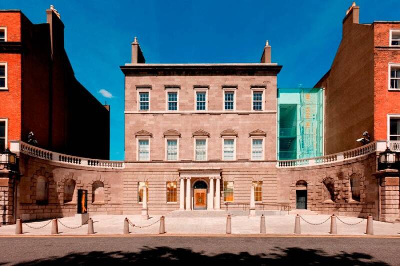
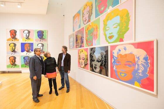
Entry 8 : Hugh Lane gallery
Hugh Lane Gallery is an iconic art gallery located in Dublin city centre. The collection regularly changes due to exchanges with galleries in England, as well as temporary exhibitions, meaning the experience can vary depending on when you visit. I have been to the gallery three times, and each time I found it really engaging. What stood out to me most was not just the artwork itself, but the way it is presented and curated. The layout of the gallery feels very considered, with different spaces dedicated to specific artists or styles. This made the experience feel structured and easy to navigate, which I realised is similar to how user experience is considered in product design. One example of this is the display of Harry Clarke’s stained glass work, which is placed in a darker room with lighting positioned behind the pieces. This enhances the detail and colour, allowing the viewer to experience the work as intended. It made me more aware of how lighting and environment can completely change how materials and colour are perceived, which is something that directly relates to CMF and product presentation. I also found the reconstruction of Francis Bacon’s studio particularly interesting. The space is preserved exactly as it was, showing the chaotic and layered nature of his creative process. Seeing this made me think about how design is not always linear or clean, but often involves experimentation, iteration, and disorder before reaching a final outcome. Overall, the gallery made me more aware of how design goes beyond the object itself, and includes how it is presented, experienced, and interacted with. It also highlighted the importance of context, lighting, and spatial organisation, which are all relevant to how products are designed and displayed. Even though it is an art gallery, the experience reinforced ideas that can be applied to product design, particularly in terms of user interaction, perception, and presentation.